위와 같이 프리뷰 영상을 보아도... 구글 스트리트 뷰 전격 지원, UI 및 소설네트워크 기능의 강화, 웹에서의 여러가지 플러그인의 지원, 구글 eBook( 구글이 책분야까지 넓혀가고 있었네요... )

안드로이드 개발자 SDK 에 릴리즈 된 Android 3.0
New User Features
New UI designed from the ground up for tablets
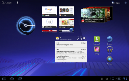
Android 3.0 is a new version of the Android platform that is specifically optimized for devices with larger screen sizes, particularly tablets. It introduces a brand new, truly virtual and “holographic” UI design, as well as an elegant, content-focused interaction model.
Android 3.0 builds on the things people love most about Android — refined multitasking, rich notifications, Home screen customization, widgets, and more — and transforms them with a vibrant, 3D experience and deeper interactivity, making them familiar but even better than before.
The new UI brings fresh paradigms for interaction, navigation, and customization and makes them available to all applications — even those built for earlier versions of the platform. Applications written for Android 3.0 are able to use an extended set of UI objects, powerful graphics, and media capabilities to engage users in new ways.
- 해상도가 올라가지 않는 이상 윈도우 바탕화면과 같은 UI 가 모바일에서 어떤 힘을 발휘할지는 아직 모르겠네요
System Bar, for global status and notifications
Across the system and in all applications, users have quick access to notifications, system status, and soft navigation buttons in a System Bar, available at the bottom of the screen. The System Bar is always present and is a key touchpoint for users, but in a new "lights out mode" can also be dimmed for full-screen viewing, such as for videos.
Action Bar, for application control
In every application, users have access to contextual options, navigation, widgets, or other types of content in an Action Bar, displayed at the top of the screen. The Action Bar is always present when an application is in use, although its content, theme, and other properties are managed by the application rather than the system. The Action Bar is another key touchpoint for users, especially with action items and an overflow dropdown menu, which users frequently access in a similar manner in most applications.
Customizable Home screens
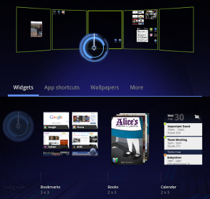
Five customizable Home screens give users instant access to all parts of the system from any context. Each screen offers a large grid that maintains spatial arrangement in all orientations. Users can select and manipulate Home screen widgets, app shortcuts, and wallpapers using a dedicated visual layout mode. Visual cues and drop shadows improve visibility when adjusting the layout of shortcuts and widgets. Each Home screen also offers a familiar launcher for access to all installed applications, as well as a Search box for universal search of apps, contacts, media files, web content, and more.
-2.2 버전과 같은 ADW 런처 등 홈 화면 전용 어플을 사용하지 않아도, 가장 최적의 성능으로 홈 스크린을 꾸밀 수 있을 듯 보이네요^^
Recent Apps, for easy visual multitasking
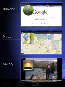
Multitasking is a key strength of Android and it is central to the Android 3.0 experience. As users launch applications to handle various tasks, they can use the Recent Apps list in the System Bar to see the tasks underway and quickly jump from one application context to another. To help users rapidly identify the task associated with each app, the list shows a snapshot of its actual state when the user last viewed it.
-하드웨어 성능은 받쳐주니 이와 같이 멀티태스킹 기능 강화는 빛을 발하리라 생각됩니다.
Redesigned keyboard
The Android soft keyboard is redesigned to make entering text fast and accurate on larger screen sizes. The keys are reshaped and repositioned for improved targeting, and new keys have been added, such as a Tab key, to provide richer and more efficient text input. Users can touch-hold keys to access menus of special characters and switch text/voice input modes from a button in the System Bar.
Improved text selection, copy and paste
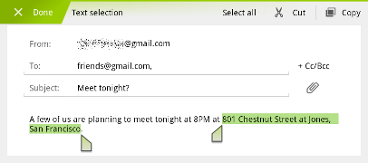
When entering or viewing text, a new UI lets users quickly select a word by press-hold and then adjust the selection area as needed by dragging a set of bounding arrows to new positions. Users can then select an action from the Action Bar, such as copy to the clipboard, share, paste, web search, or find.
-저야 커티를 사용해서 불편함이 없지만, 기존 터치 스크린 사용자들은 천지인과 같이 영어가 줄여지는 것보다는 키보드로 리디자인된 부분은 매력적일 것 같습니다.
New connectivity options
Android 3.0 includes new connectivity features that add versatility and convenience for users. Built-in support for Media/Picture Transfer Protocol lets users instantly sync media files with a USB-connected camera or desktop computer, without needing to mount a USB mass-storage device. Users can also connect full keyboards over either USB or Bluetooth, for a familiar text-input environment. For improved wi-fi connectivity, a new combo scan reduces scan times across bands and filters. New support for Bluetooth tethering means that more types of devices can share the network connection of an Android-powered device.
-전 이부분이 굉장히 매력적이였습니다. 휴대폰을 사용하면서 USB(이동식 디스크)를 연결해서 영화등을 재생하고 할 수 없을까 하는 의문이 참 많았는데, USB가 지원이 된다고 합니다. (휴대폰의 두께가 조금 두꺼워지지않을까 싶기도하고, 이번 버전은 태블릿에 최적화된다는 점에서 태블릿에만 추가될 것 같기도 합니다.)
Updated set of standard apps
The Android 3.0 platform includes an updated set of standard applications that are designed for use on larger screen devices. The sections below highlight some of the new features.
-기존 어플리케이션과 호환이 되지 않는다면... 아마 개발자들은 구글에게 등을 돌렸을 겁니다.
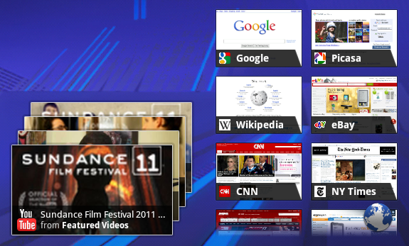
The browser includes new features that let users navigate and organize more efficiently. Multiple tabs replace browser windows and a new “incognito” mode allows anonymous browsing. Bookmarks and history are presented and managed in a single unified view. Users can now choose to automatically sign into Google sites on the browser with a supplied account and sync bookmarks with Google Chrome. New multitouch support is now available to JavaScript and plugins. Users can enjoy a better browsing experience at non-mobile sites through an improved zoom and viewport model, overflow scrolling, support for fixed positioning, and more.
Camera and Gallery
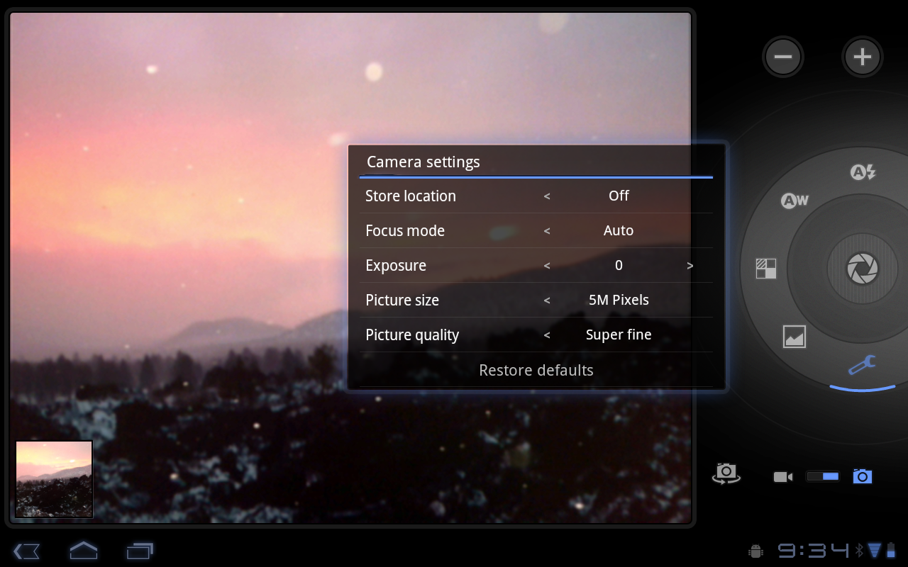
The Camera application has been redesigned to take advantage of a larger screen for quick access to exposure, focus, flash, zoom, front-facing camera, and more. To let users capture scenes in new ways, it adds built-in support for time-lapse video recording. The Gallery application lets users view albums and other collections in full-screen mode, with easy access to thumbnails for other photos in the collection.
Contacts
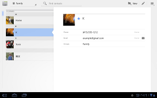
The Contacts app uses a new two-pane UI and Fast Scroll to let users easily organize and locate contacts. The application offers improved formatting of international phone numbers as user types, based on home country and an international number parsing library. Contact information is presented in a card-like UI, making it easier for users to read and edit contacts.
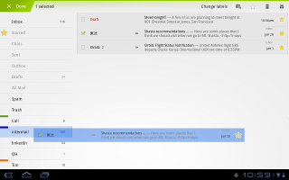
The Email application uses a new two-pane UI to make viewing and organizing messages more efficient. The app lets users select one or more messages, then select an action from the Action Bar, such as moving them to a folder. Users can sync attachments for later viewing and keep track of email using a home screen Widget.
New Developer Features
The Android 3.0 platform is designed specially to meet the unique needs of applications on devices with larger screen sizes. It offers all of the tools developers need to create incredible visual and interaction experiences on these devices.
- New UI framework for creating great tablet apps
- High-performance 2D and 3D graphics
- Support for multicore processor architectures
- Rich multimedia and connectivity
- Enhancements for enterprise
- Compatibility with existing apps
New UI Framework for creating great tablet apps
Activity fragments, for greater control of content and design flexibility
Starting with Android 3.0, developers can break the Activities of their applications into subcomponents called Fragments, then combine them in a variety of ways to create a richer, more interactive experience. For example, an application can use a set of Fragments to create a true multipane UI, with the user being able to interact with each pane independently. Fragments can be added, removed, replaced, and animated inside an Activity dynamically, and they are modular and reusable across multiple Activities. Because they are modular, Fragments also offer an efficient way for developers to write applications that can run properly on both larger screen as well as smaller screen devices.
-오오, 개발자인 제 입장에서는 굉장히 관심이 가는 부분입니다. 아무래도 UI 를 입힐 떄 굉장히 고생을 하는데, 조금은 쉽게 바뀔것이란 생각이 드네요. 액티비티는 안드로이드 어플리케이션의 한 화면, 하나의 판을 이야기 하는데요. 디자인 부분 뿐 아니라 해상도 조절또한 쉽게 가능할 것으로 보입니다. ( 예를 들어 태블릿화면과 스마트폰 화면의 해상도 크기 차이 )
Redesigned UI widgets
Android 3.0 offers an updated set of UI widgets that developers can use to quickly add new types of content to their applications. The new UI widgets are redesigned for use on larger screens such as tablets and incorporate the new holographic UI theme. Several new widget types are available, including a 3D stack, search box, a date/time picker, number picker, calendar, popup menu, and others. Most of the redesigned UI widgets can now be used as remote views in application widgets displayed on the home screen. Applications written for earlier versions can inherit the new Widget designs and themes.
Expanded Home screen widgets
Home screen widgets are popular with users because they offer fast access to application-specific data directly from the home screen. Android 3.0 lets developers take home screen widgets to the next level, offering more types of content and new modes of interaction with users. Developers can now use more standard UI widget types home screen widgets, including widgets that let users flip through collections of content as 3D stacks, grids, or lists. Users can interact with the home screen widgets in new ways, such as by using touch gestures to scroll and flip the content displayed in a widget.
-이 부분은 바탕화면 위젯을 개발자 입장에서 기본적으로 제공해주는 몇가지 틀로 간단하게 만들 수 있다는 부분이네요. 역시나 매력적입니다.
Persistent Action Bar
The platform provides each application with its own instance of the Action Bar at the top of the screen, which the application can use to give the user quick access to contextual options, widgets, status, navigation, and more. The application can also customize the display theme of its Action Bar instance. The Action Bar lets developers expose more features of their applications to users in a familiar location, while also unifying the experience of using an application that spans multiple Activities or states.
Richer notifications
Notifications are a key part of the Android user experience because they let applications show key updates and status information to users in real time. Android 3.0 extends this capability, letting developers include richer content and control more properties. A new builder class lets developers quickly create notifications that include large and small icons, a title, a priority flag, and any properties already available in previous versions. Notifications can offer more types of content by building on the expanded set of UI Widgets that are now available as remote Views.
Multiselect, clipboard, and drag-and-drop
The platform offers convenient new interaction modes that developers can use. For managing collections of items in lists or grids, developers can offer a new multiselect mode that lets users choose multiple items for an action. Developers can also use a new system-wide Clipboard to let users easily copy any type of data into and out of their applications. To make it easier for users to manage and organize files, developers can now add drag-and-drop interaction through a DragEvent framework.
High-performance 2D and 3D graphics
New animation framework
The platform includes a flexible new animation framework that lets developers easily animate the properties of UI elements such as Views, Widgets, Fragments, Drawables, or any arbitrary object. Animations can create fades or movement between states, loop an animated image or an existing animation, change colors, and much more. Adding animation to UI elements can add visual interest to an application and refine the user experience, to keep users engaged.
Hardware-accelerated 2D graphics
Android 3.0 offers a new hardware-accelerated OpenGL renderer that gives a performance boost to many common graphics operations for applications running in the Android framework. When the renderer is enabled, most operations in Canvas, Paint, Xfermode, ColorFilter, Shader, and Camera are accelerated. Developers can control how hardware-acceleration is applied at every level, from enabling it globally in an application to enabling it in specific Activities and Views inside the application.
Renderscript 3D graphics engine
Renderscript is a runtime 3D framework that provides both an API for building 3D scenes as well as a special, platform-independent shader language for maximum performance. Using Renderscript, you can accelerate graphics operations and data processing. Renderscript is an ideal way to create high-performance 3D effects for applications, wallpapers, carousels, and more.
Support for multicore processor architectures
Android 3.0 is the first version of the platform designed to run on either single or multicore processor architectures. A variety of changes in the Dalvik VM, Bionic library, and elsewhere add support for symmetric multiprocessing in multicore environments. These optimizations can benefit all applications, even those that are single-threaded. For example, with two active cores, a single-threaded application might still see a performance boost if the Dalvik garbage collector runs on the second core. The system will arrange for this automatically.
Rich multimedia and connectivity
HTTP Live streaming
Applications can now pass an M3U playlist URL to the media framework to begin an HTTP Live streaming session. The media framework supports most of the HTTP Live streaming specification, including adaptive bit rate.
Pluggable DRM framework
Android 3.0 includes an extensible DRM framework that lets applications manage protected content according to a variety of DRM mechanisms that may be available on the device. For application developers, the framework API offers an consistent, unified API that simplifies the management of protected content, regardless of the underlying DRM engines.
Digital media file transfer
The platform includes built-in support for Media/Picture Transfer Protocol (MTP/PTP) over USB, which lets users easily transfer any type of media files between devices and to a host computer. Developers can build on this support, creating applications that let users create or manage media files that they may want to transfer or share across devices.
-오호, USB로 연결하여 미디어 파일을 전송하는 시대는 끝났다라고 선언하는 부분이네요. 기존 컴퓨터와 어떤방법으로도 연결이 가능하고 하는데... 블루투스야 속도문제 떄문에, WIFI로 FTP 로 다운받는 부분일까싶네요.
More types of connectivity
The platform offers new connectivity that developers can build on. API support for Bluetooth A2DP and HSP profiles lets applications query Bluetooth profiles for connected devices, audio state, and more, then notify the user. For example, a music application can check connectivity and status and let the user know that music is playing through a stereo headset. Applications can also register to receive system broadcasts of pre-defined vendor-specific AT commands, such as Platronics Xevent. For example, an application could receive broadcasts that indicate a connected device's battery level and could notify the user or take other action as needed. Applications can also take advantage of the platform's new support for full keyboards connected by USB or Bluetooth.
Enhancements for enterprise
In Android 3.0, developers of device administration applications can support new types of policies, including policies for encrypted storage, password expiration, password history, and password complex characters required.
Compatibility with existing apps
Android 3.0 brings a new UI designed for tablets and other larger screen devices, but it also is fully compatible with applications developed for earlier versions of the platform, or for smaller screen sizes. Existing applications can seamlessly participate in the new holographic UI theme without code changes, by adding a single attribute in their manifest files. The platform emulates the Menu key, which is replaced by the overflow menu in the Action Bar in the new UI. Developers wanting to take fuller advantage of larger screen sizes can also create dedicated layouts and assets for larger screens and add them to their existing applications.
전체적으로는 꽤나 완성도가 높아지는 듯 합니다.
2.2 와 3.0 의 UI 만 단순 비교해도 아예 달라지는 걸 보면, 아마 윈도우 모바일 6.5 와 윈도우 폰 7 정도의 차이라 생각되는데,
(물론 기존 어플과의 호환이 된다는 발표를 했네요)
항상 기본 브라우저가 좋지 않아, 브라우저 어플리케이션을 다운받아 사용했는데, 정말 데스크탑 구글 크롬플러스와 같이 사생활보호 기능등 부터 시작해서 편리하고 빠른 인터넷 환경을 접할 수 있을 거란 생각이 듭니다.
2.2 버전을 VMware에 깔아 PC에서 구동을 시켜봤었는데, (솔직히 저사양의 OS로는 조금 문제가 많았습니다.)
3.0 버전은 충분히 단순저사용 PC OS까지도 가능하리라 생각됩니다. 이래저래 위에 코멘트를 달아놨는데, 괜히 이상하게 번역했다 오역될까봐 원문으로 올립니다.
휴~ 휴대폰 주기가 점점 짧아지는 느낌이지만, 3.0 너무 기대되네요!
'옛글 > 모바일 이야기' 카테고리의 다른 글
| iOS 4.3... 하루만에 제일브레이크(탈옥) (0) | 2011.03.18 |
|---|---|
| PSP(playstaion) Phone, Ipad 대항마로 준비 중 (2) | 2011.03.18 |
| 안드로이드 1Mobile Market으로 게임편하게 다운받자! (0) | 2011.02.27 |
| 재미있는 안드로이드 만드는 어플리케이션 (0) | 2011.02.27 |
| SK 블랙베리 런칭, 무슨 자신감일까? (16) | 2011.02.22 |
